Analytics
Usage
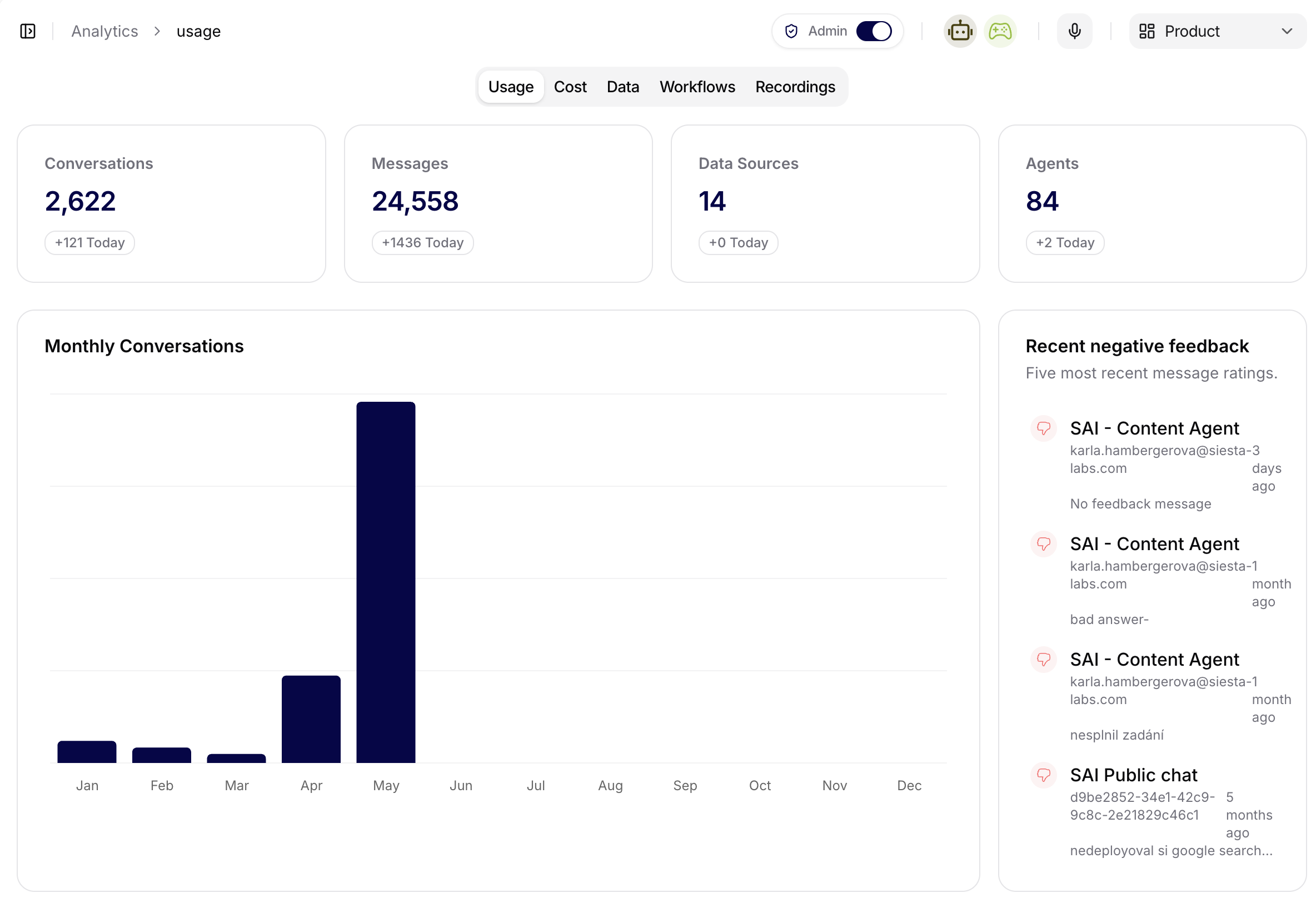
Use Usage to understand overall activity in the platform. This tab is the first place to check when you want to know whether users are actively working with agents and conversations.
The Usage screenshot shows headline KPIs for conversations, messages, connected data sources, and active agents. Below the KPIs, the monthly conversations chart makes adoption trends visible across the calendar year. The side panel lists recent negative feedback so admins can jump from an analytics signal into the conversations or agents that need follow-up.
Typical questions:
- Are conversations and messages increasing or decreasing?
- Did activity change after a rollout, workflow update, or agent configuration change?
- Are users engaging with the expected assistants?
Cost
Use Cost to track token and model spend. This tab helps admins understand how AI usage translates into consumption and where limits or optimization may be needed.
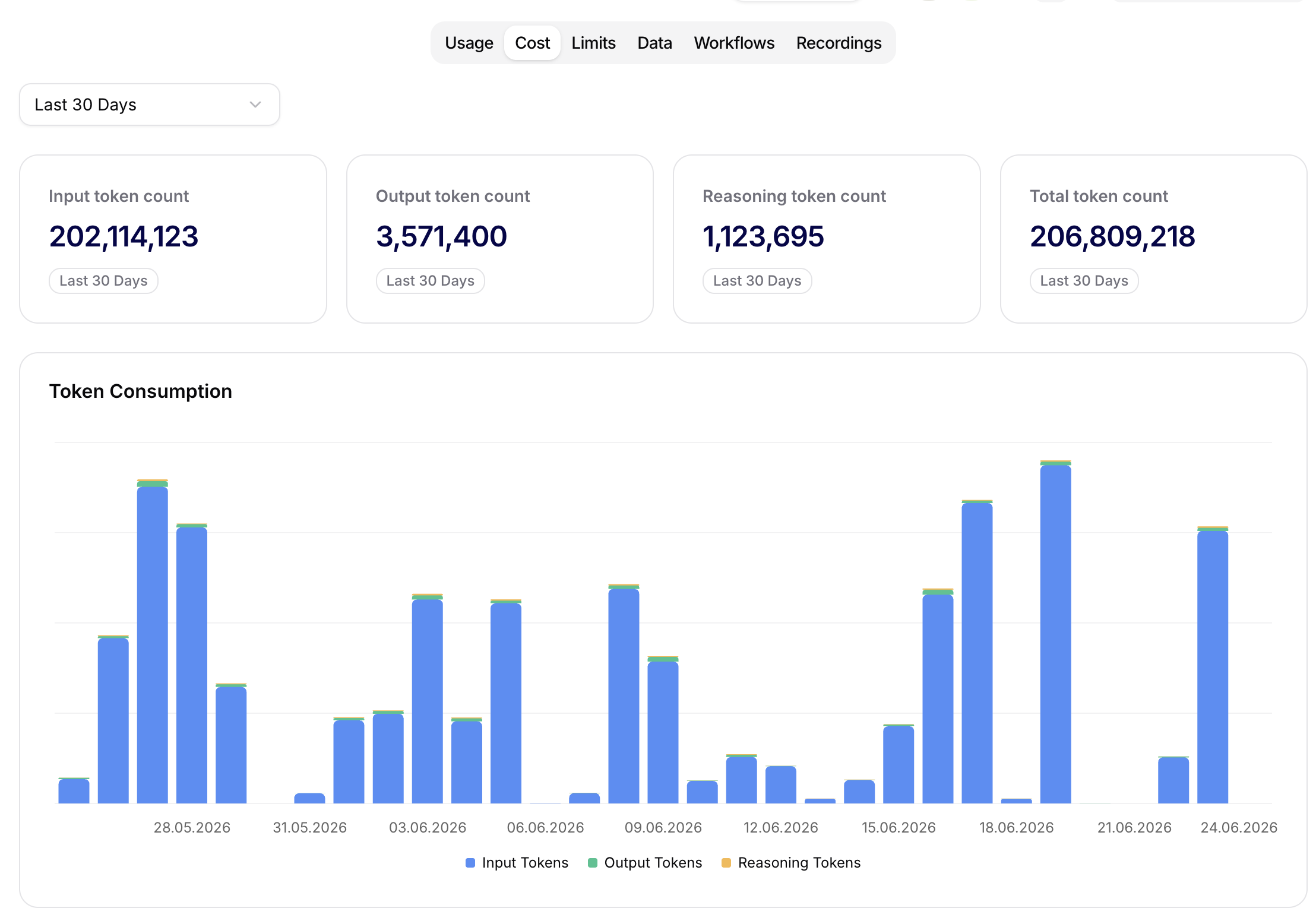
The Cost tab is connected to the same cost and token accounting that powers organization usage controls. The date range selector applies to all cards and charts on the tab, so change it first before comparing totals.
The headline cards separate token usage into:
- Input token count: tokens sent into model requests, including user messages, instructions, retrieved context, tool context, and other prompt material.
- Output token count: tokens generated by the model in the final answer or intermediate assistant output.
- Reasoning token count: internal reasoning tokens reported by models that expose reasoning usage.
- Total token count: combined input, output, and reasoning tokens for the selected range.
The Token Consumption chart shows daily token volume split by input, output, and reasoning tokens. Use it to find the exact day where usage increased before opening conversations, workflows, or agent analytics for deeper investigation.
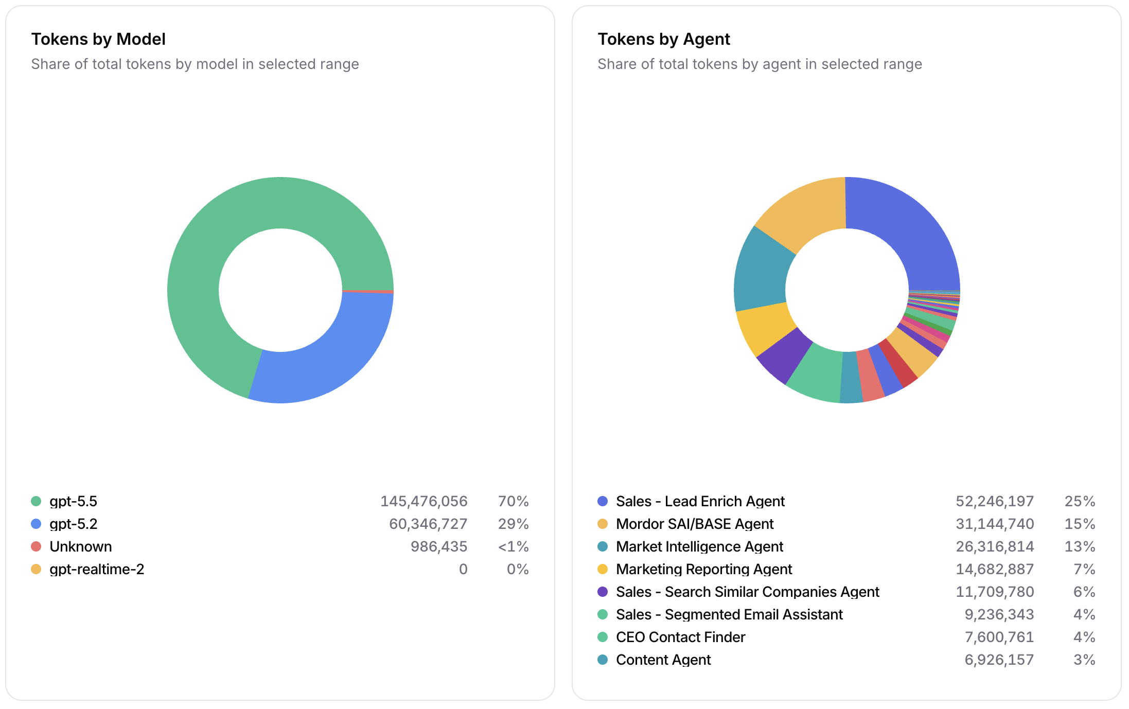
The lower Cost charts explain where the token total came from:
- Tokens by Model shows the share of selected-range tokens by model. This is the fastest way to spot whether traffic is concentrated on a more expensive or more capable model than expected.
- Tokens by Agent shows the share of selected-range tokens by agent. Use it to find the agents that are driving organization spend and decide where prompt, retrieval, workflow, or model tuning should happen first.
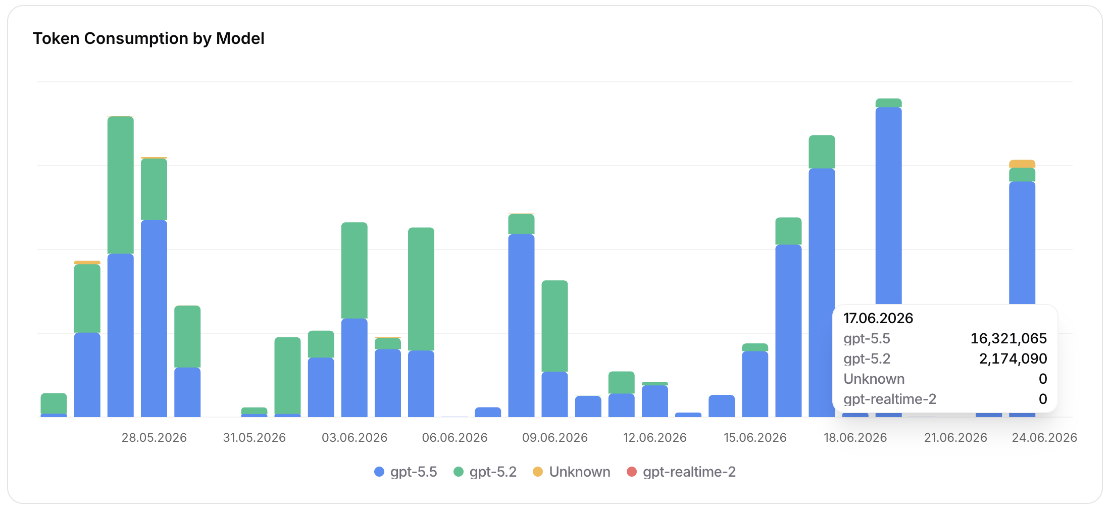
- Token Consumption by Model shows model usage over time. The stacked bars make model migrations, fallback behavior, and one-day spikes visible; the tooltip exposes the exact token count per model for a selected date.
If an Azure AI Foundry model router deployment is used, Siesta AI analytics should be read together with Azure Monitor. Siesta AI shows which agent, team, user, or model connection is consuming tokens; Azure Monitor is the source of truth for the router's underlying model distribution.
Typical questions:
- Which period has the highest AI cost?
- Did a newly deployed agent or workflow increase usage?
- Should model connections receive stricter token limits?
- Which model is responsible for most token consumption?
- Which agent is responsible for a usage spike?
Limits
Use Limits to monitor and configure preventive token guardrails for LLM/model connections. Cost analytics shows historical usage; Limits shows how current daily and weekly usage compares with configured budgets.
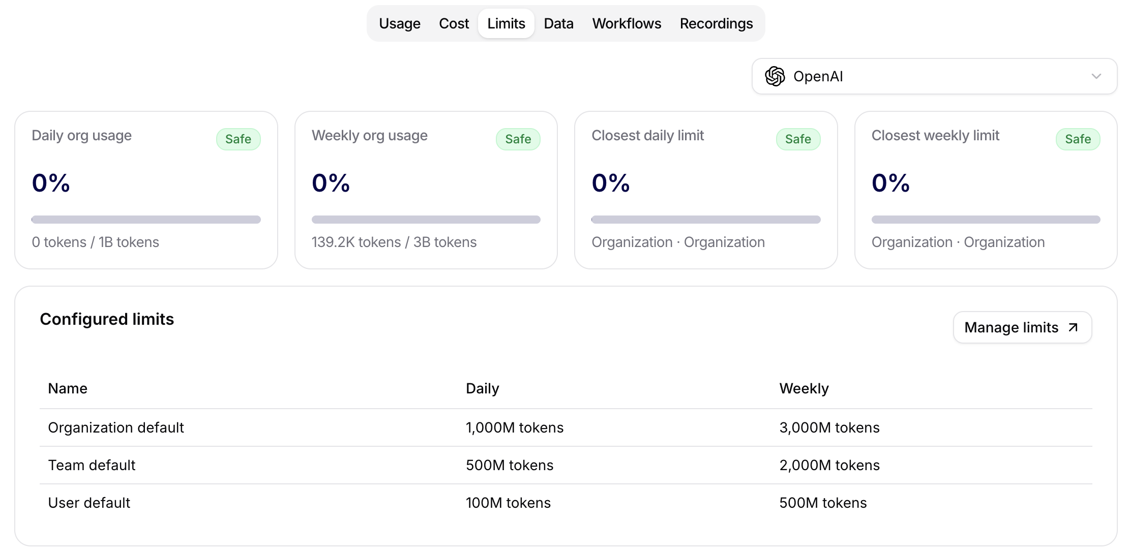
The provider selector at the top of the tab chooses the model provider or model connection whose limits you are reviewing, such as OpenAI. The top cards summarize the current limit state:
- Daily org usage: organization token usage today compared with the configured organization daily limit.
- Weekly org usage: organization token usage this week compared with the configured organization weekly limit.
- Closest daily limit: the nearest daily limit to being exhausted across organization, team, or user scopes.
- Closest weekly limit: the nearest weekly limit to being exhausted across organization, team, or user scopes.
Each card shows the percentage used, a progress bar, the consumed tokens, and the configured limit. Status labels such as Safe indicate whether the current usage is still within the expected budget.
The Configured default limits table shows an All models row plus one row for every configured model default. Each row compares Organization, Team, and User daily/weekly thresholds. Not configured means that the row has no explicit threshold for that period; it does not mean that usage is zero. Use Manage limits to open the editable connection settings.
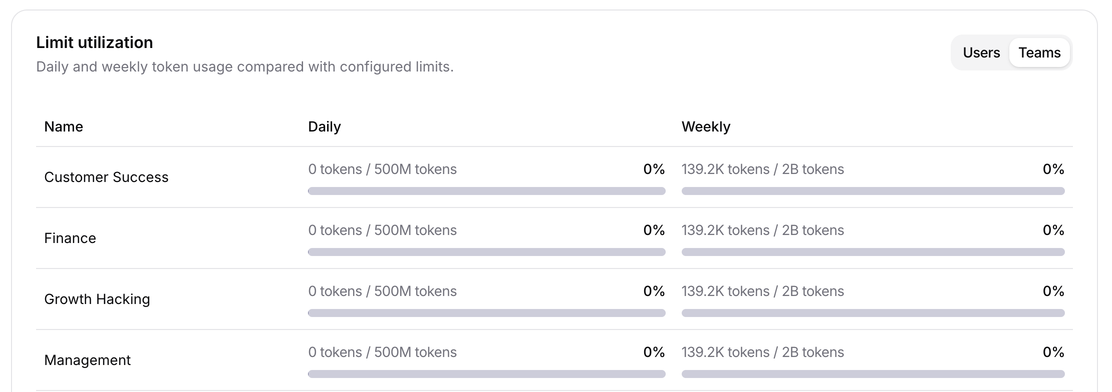
Utilization by model compares model-specific daily and weekly usage with configured model defaults and subject overrides. Expand a model to identify the Organization, User, or Team closest to its effective threshold. Use the model and subject context in the row: all-model usage and model-specific usage are separate counters and can have different effective limits.
The User and Team utilization views compare actual usage with configured daily and weekly limits for individual subjects. Each row shows consumed tokens, effective limit, percentage used, and a progress bar. Statuses distinguish normal usage, warning or critical utilization, unlimited thresholds, and models with no recorded usage.
Use this view before changing limits: if usage is concentrated in one team, adjust the team override; if the whole organization is approaching the same threshold, change the organization default.
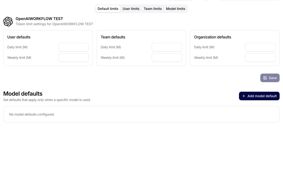
The LLM token limit view is scoped to a specific model connection, for example Siesta AI LLM - Default. Limits are configured in millions of tokens (M) and can be defined at multiple levels:
- User defaults: the default daily and weekly budget for users on the selected connection.
- Team defaults: the default daily and weekly budget for teams on the selected connection.
- Organization defaults: the workspace-level daily and weekly budget for the selected connection.
- User overrides: per-user rows where admins can set a custom daily or weekly budget and disable a specific override.
- Team overrides: per-team rows for team-specific budgets.
- Model defaults: User, Team, and Organization defaults that apply only to one named model.
- Model limits: per-model User or Team overrides, filterable by model, scope, and subject.
Save changes after editing defaults or override rows. An active subject override replaces its complete daily/weekly default pair in the same scope. A missing or Disabled override inherits the applicable defaults; Disabled does not deny connection access. All-model and model-specific policies are checked separately, and reaching any applicable User, Team, or Organization threshold returns a controlled daily or weekly token-limit error.
Limits are most useful after Cost analytics identifies a high-volume model, agent, or team. Set the broad connection defaults first, add model defaults for models with a different cost or operating profile, and create User or Team overrides only where the observed usage pattern justifies a different budget. The exact configuration and precedence are documented in Connections Management.
Data
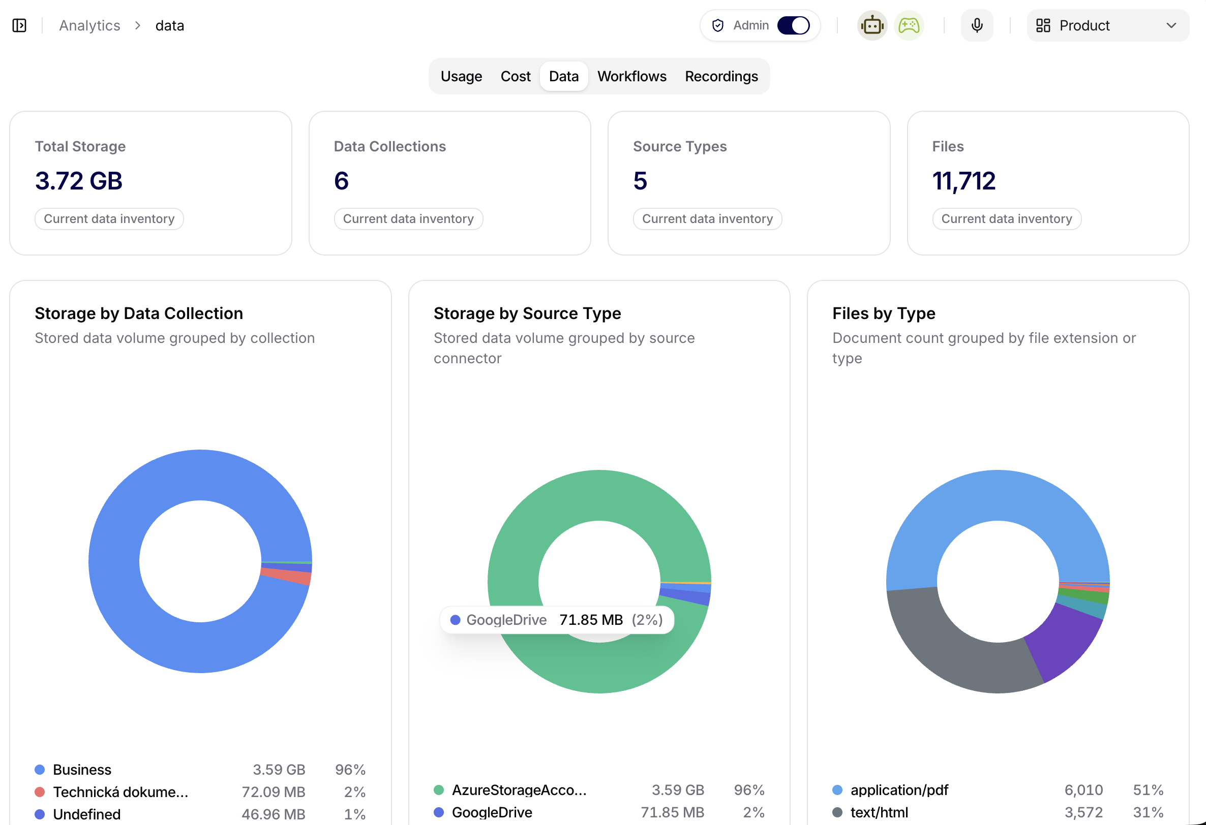
Use Data to inspect the current RAG inventory and find collections or sources that need a closer operational check. It reports the data that is currently represented in the organization; it is not a billing ledger and it does not replace source-level processing logs.
The headline cards answer four different questions:
| Card | What it counts |
|---|---|
| Total Storage | Current stored data volume included in the analytics inventory. |
| Data Collections | Collections represented by the current inventory. |
| Source Types | Distinct connector/source types represented by those sources. |
| Files | Documents represented by the inventory. This is not the number of chunks. |
Use Storage Breakdown to change the grouping between User, Data Collection, Data Source, and Source Type. The same stored volume can therefore be viewed by ownership, business boundary, individual source, or connector technology. The breakdown does not duplicate the data; it changes only how the current inventory is grouped.
The supporting charts answer narrower questions:
- Files by Type groups document count by file extension or reported type.
- Total Analyzed Pages by Data Source compares the number of pages processed for sources that report page analysis.
- Total Tokens by Data Source compares the token total reported for indexed source content. Do not treat this chart as LLM request consumption; model input, output, reasoning, and cost belong under Cost.
- RAG Data Ingested Over Time by User groups the current indexed source bytes by the date on which the source was first discovered and by the user who created the data source. Daily and Weekly change the time bucket, while the date range limits the displayed discovery dates.
The ingestion chart is a snapshot of the current indexed footprint, not a history of synchronization executions. A recurring sync may enumerate the whole configured source but leave this chart unchanged when no indexed content changes. Reprocessing an existing document also does not mean that its full byte size is added again. Use source Logs and document status to investigate an individual sync, retry, or processing failure.
Original remote binaries retained through Store source files are a separate operational storage decision from extracted text and indexed chunks. Review the source configuration and Source files stored badge alongside these analytics; do not use an inventory chart alone to infer the retention state of every original. See Store Source Files.
When more creators are present than the chart can display clearly, the leading series remain separate and the rest are combined into an Other series. Use the source and collection detail instead of inferring individual ownership from Other.
Use this tab together with Data Collections when answer quality is low. Analytics can reveal a missing source type, an unexpectedly small collection, a dominant source, or a file-type imbalance. The collection detail then proves whether the expected documents exist, while Processing, Sync, and Troubleshooting explains document states, discovery, retries, chunks, and source logs.
Typical questions:
- Is the expected collection, source type, and file population represented?
- Which collection, source, creator, or connector accounts for most stored data?
- Did newly discovered indexed data appear in the expected daily or weekly bucket?
- Does low answer quality correlate with a missing source, unexpected file mix, or processing failure?
Workflows
Use Workflows to monitor workflow usage and outcomes. This view is useful after publishing a workflow to a pilot team or after making a workflow available more broadly.
The Workflows tab summarizes automation activity for the selected date range. The KPI cards show:
- Workflow Executions: total workflow runs in the range.
- Operations: total executed workflow operations, which can be higher than executions because one workflow run may contain multiple steps.
- Operation Categories: number of operation categories represented in the range.
- Active Periods: number of time buckets where workflow activity occurred.
Use Executions Over Time to see workflow runs grouped by the selected time range. This chart is the fastest way to spot rollout effects, schedule spikes, quiet periods, or a sudden drop in automation activity.
Use Operations by Workflow to understand which workflow or operation type is responsible for most automation volume. The donut chart shows share, count, and percentage for categories such as assistant-triggered runs, scheduled workflows, webhook workflows, recording transcription flows, and tool functions.
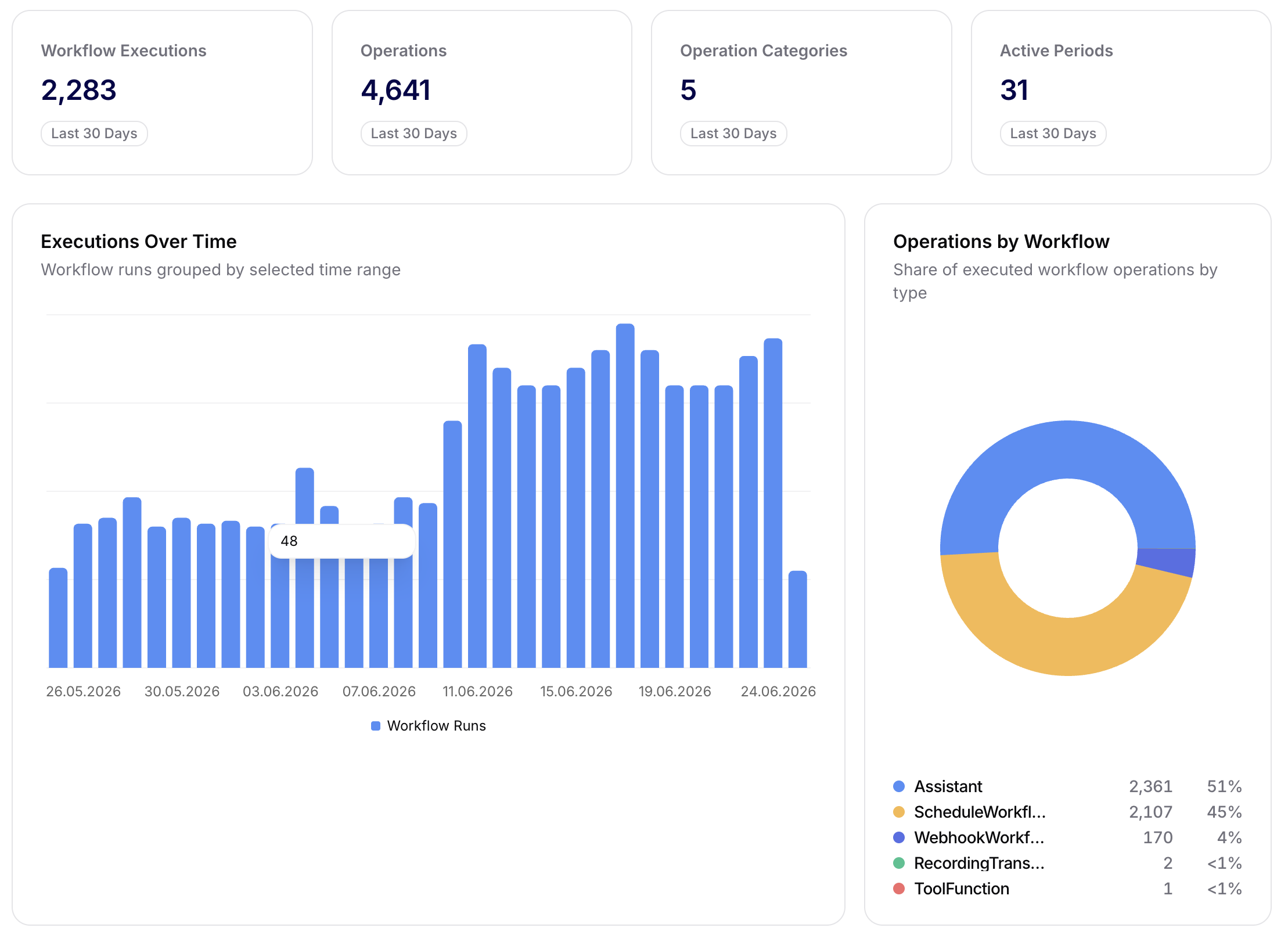
This tab is especially useful after releasing a new workflow to production or after changing triggers, conditions, or external connections. Compare expected operational volume with the real run pattern before assuming a workflow is healthy.
Typical questions:
- Which workflows are being run most often?
- Are workflow runs completing successfully?
- Did a workflow change affect usage or failure patterns?
Recordings
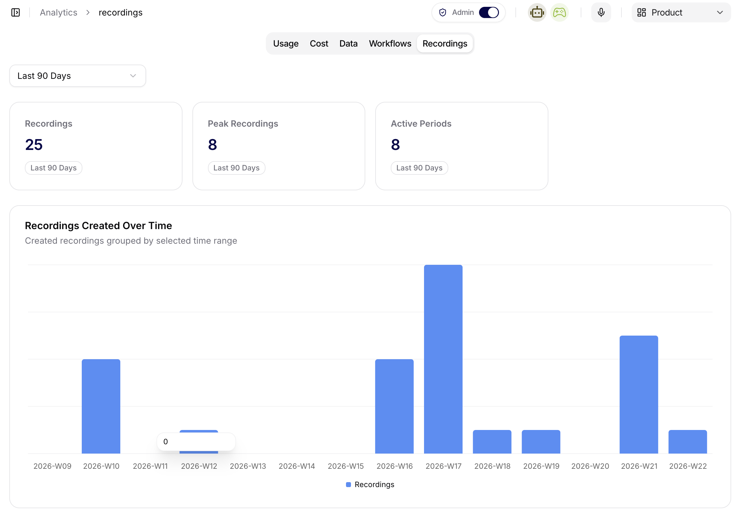
Use Recordings to review recording activity and processing trends. This helps teams understand whether recordings are being captured, processed, and reused as expected.
The Recordings screenshot shows the total number of recordings, peak recording volume, and active recording periods. The time-series chart groups created recordings by week for the selected range, making it easier to spot adoption spikes, quiet periods, or irregular recording behavior.
If recordings are used as a source for follow-up chat, analytics, or operational review, use this tab to confirm that uploads and processing continue at the expected pace after a rollout.
Typical questions:
- Are recordings being created regularly?
- Are there periods with unusual recording activity?
- Does recording usage support the intended team workflow?
Chart Interpretation
Below the KPIs, analytics views use charts to show trends over time. For quick diagnostics:
- Sharp drop = check the availability of agents, connected channels, or recent changes in prompts or workflows.
- Growth = verify whether capacity (rate limits, resources) is keeping up.
Feedback and Follow-up
When analytics points to quality or adoption problems, follow the signal into the related operational page:
- Open Conversations to inspect the conversation that created the signal.
- Open Agents to adjust instructions, tools, prompts, or model settings.
- Open Data to check whether the agent has the right data collection.
- Open Workflows when the signal may come from automation volume or failed orchestration behavior.
- Open Recordings when the issue is tied to transcript availability or uneven recording intake.
- Open Logs to inspect audit events or tool executions.
Tips for Working with Data
- Monitor daily changes in KPIs to quickly identify fluctuations.
- If the number of messages is increasing without a rise in conversations, check the quality of responses (feedback) and possibly adjust the instructions.
- With zero data sources, verify that agents have the correct datasets and access assigned.